Do we need to stop talking about the design process?
In 2016, Carissa Carter, Director of Teaching and Learning at the Stanford d.school. wrote an article called Let’s stop talking about THE design process. It was timely. At least I thought so. Probably because I was working at an innovation agency at the time and I was often tasked with communicating ‘the design process’ to clients.
As ‘Innovation’ and ‘design thinking’ became something people wanted to package and sell, the need to describe it, define it and refine it became more urgent. There followed a spew of conceptual models and diagrams. Littered with buzzwords. Many of them captured on the excellent Tumblr Design (Fucking)Thinking but perhaps the most famous being the Design Councils Double Diamond.
Diagrams and design education
I think carefully about how to use these diagrams as an educator. They can be useful framing devices for learners who need to be able to talk about what they do in some kind of authentic way. However, the problem with any attempts to capture disciplinary ways of thinking and practicing, is that thinking and practicing are often tacit, complex and radically contextual in a way that a single diagram can never really capture. Any diagram is generally a bit of an arbitrary exercise.
There’s also the tricky problem of othering process. All diagrams are biases, they privilege particular ways of knowing and seeing. We must address process somehow, but we must be careful not to present it as THE process.
A workshop
From this sticky conundrum, emerges a workshop called Visualizing Process – which took place in the second week of Unit 1. It was designed and co-delivered with Abbie Vickress. Towards the end of the workshop, we asked the students to reflect on their own processes and visualise them in the form of a diagram. And this is where it got really interesting. In describing their process, the student diagrams revealed some very interesting pictures of the ways that they conceptualised knowledge and problems. This was a completely unintended outcome. One we had no time to discuss. Because we had no idea it was going to happen.
Below are the three main visual themes that emerged from the different diagrams.
Process as a line

A number of students drew process as a line. As an information designer, I have always understood that linear concepts of time are a particularly Western bias but this workshop was probably my first ‘live’ experience of that theory in action. It was pretty striking to notice that the linear diagrams, without exception, came from Western students.
Western thinking has been described as synthesis-oriented. Aggressively consistent with the laws of formal logic. It is suggested that in many models of thinking in the West, contradiction requires require synthesis rather than mere acceptance (Peng, K & Spencer-Rodgers, J & Nian, Z. 2006). I have often wondered if this goes some way to explaining our obsession with linear, time-based diagrams. Take our old friend the Double Diamond for example; a generalisation of the creative process, visualised as a single progressive, linear process of synthesis.
Process as a circle

This student diagram didn’t conform to a horizontal time-based order. In fact it was not immediately clear to us where the diagram began or ended. The students explained that it demonstrated the move from a poorly formed and ‘big’ idea (outer rings) to a more refined/resolved one (centre). The line style indicated how difficult he found each part of this process. He said that in his time on the course he would like to make these lines ‘smoother,’ bringing them more into harmony.
Which neatly brings us to another visual idea that ran through a large number of diagrams. One that speaks directly to the concept of dialecticism.
Process as balance
The student who drew this diagram explained that he found process and logic a difficult thing to apply to design. His approach was about trying to find harmony between conflicting information and ideas. It was one of about five diagrams the followed this visual theme.

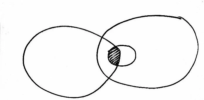
This was another fascinating example. While it follows a linear trajectory we see that it is about a reconfiguration of existing shapes.
The unexpected outcomes
I think it is always useful to reflect on unexpected outcomes. For me, they tend to reveal a lot about the assumptions and norms of both the discipline and the educational experience. There is a way that these diagrams begin to make visible (and critique) the broad range of assumptions and approaches that shape the both the discipline and curriculum. They are less portraits of process and more diagrams of ontological dispositions.
It’s also amusing to consider what we actually thought might happen… Perhaps we expected that students would be able to view their process as something separate to themselves? I realise now how ridiculous that expectation is. It says far more about out deeply engrained dualist leanings than we’d like to admit.
Impact
Looking at this workshop in the context of the whole year, this discussion about proved quite a pivotal moment for the students. Many students took the Double Diamond to be an example of best practice. They structured their research portfolios and presentations around it. It became the frame for their process. This was an unintended outcome and to my mind, a negative one.
For us as educators, the most important learnings emerged from the students diagrams. We wondered how the diagrams themselves might they form the starting points for thinking about process in future workshops. If we run this workshop again, we will start with drawing and provide the space for a conversation about individual diagrams. Students can then explore their different ideas and approaches by talking about a range of actual examples.
Could we also encourage the students to formalise these diagrams and share them with some reflective writing? Might they become a useful tool that can be revisited at various points in the course to consider how some understandings or ways of working might be shifting or changing.
I am sure the students will still create diagrams that I don’t immediately understand.
I sincerely I hope they will.
And we will probably skip the Double Diamond.
Hate that diagram (see paragraph 1)
References
Adorno, T (1973). Negative Dialectics. London: Routledge & Kegan Paul Ltd
Anderson, K. (2010). The whole learner: The role of imagination in developing disciplinary understanding. Arts and Humanities in Higher Education, 9(2), 205–221. https://doi.org/10.1177/1474022210361457
Barnett, R. (2004) Learning for an Unknown Future. Higher Education Research & Development. of Journal, Vol 23, No 3, August 2004, p247. doi: 10.1080/07294360.2012.642841
Crosby, P & Baxter Magolda, M (2006) Self-Authorship and Identity in College: An Interview with Marcia B. Baxter Magolda, Journal of College and Character, 7:1, DOI: 10.2202/1940-1639.1496
Hang, T. C. (1966). Chinese national character. Taipei: Shang Wu Co. (In Chinese).
Peng, K & Spencer-Rodgers, J & Nian, Z. (2006). Naïve Dialecticism and the Tao of Chinese Thought, in, Kim, U. Yang, K., Hwang, K (eds.) Indigenous and Cultural Psychology: Understanding People in Context. New York: Springer-Verlag. pp 247-262