What’s a desire line in education? And how can we follow them?
In a workshop at the Graphic Design Educators Network Conference this year, I asked participants to share their preferred formats for teaching graphic design.
The list was short and predictably familiar:
— workshops
— lectures
— discussions
— critiques
— tutorials
Not surprising, and yet, I was surprised. I've been doing a lot of thinking about the signature pedagogies (Shulman, 2005) of graphic design recently. Firstly, what I believe they are and then, more specifically, where the teaching and learning activities we employ as graphic designers actually support these pedagogies.
Why you might ask? Well last year, I had to write a brand new course. I then had to run that course. It was a humbling experience. A sort of permanent lilt between joy and terror. I often wondered whether I really knew anything at all.
There's perhaps nothing quite like writing and running a course to make you question your assumptions about design education. And as a Course Leader, there's probably nothing more essential.
Recurring visual metaphors
At multiple points in the year I had a recurring image flash in my head. It varied slightly from panic to panic but mostly, it looked like this:
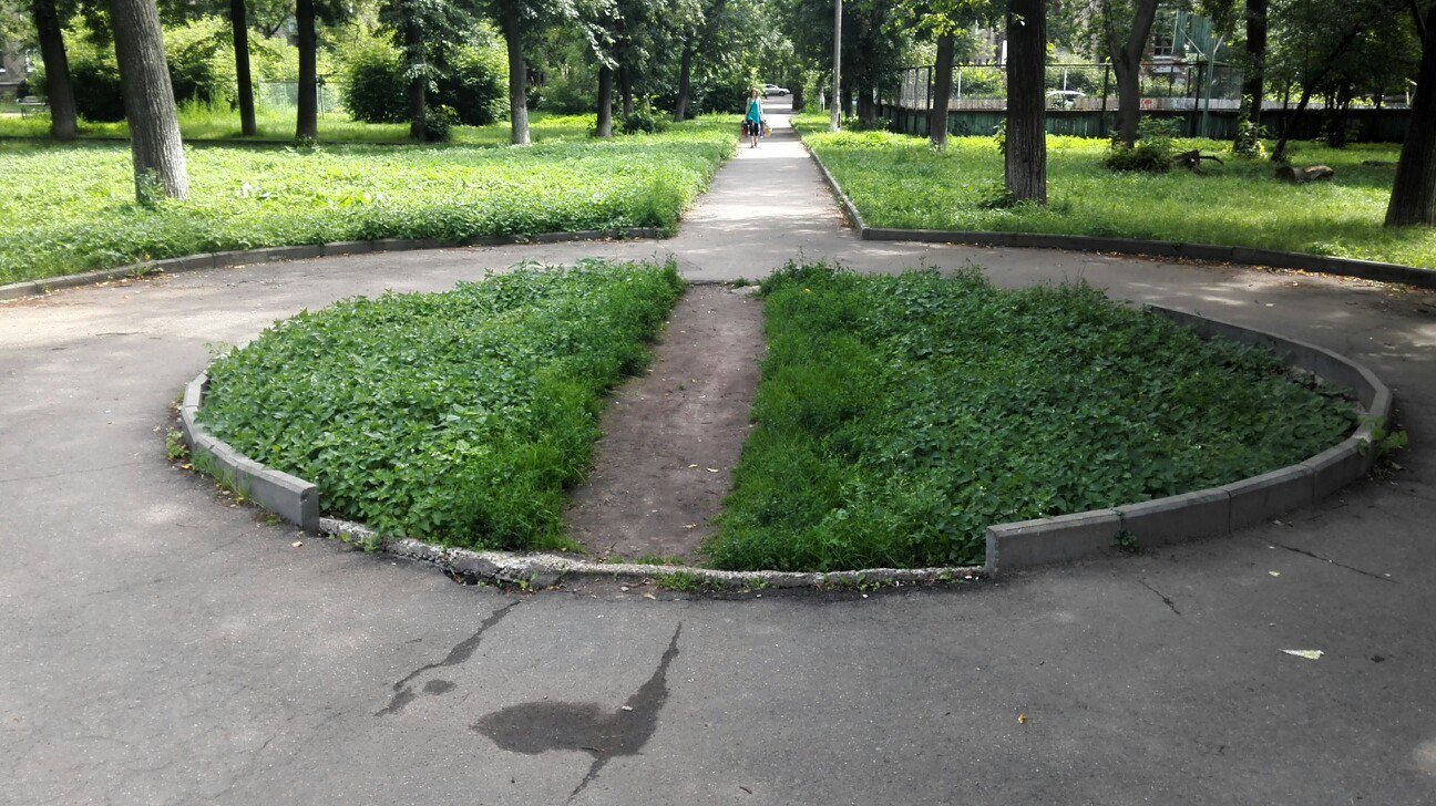
In case you're not familiar with these, they're called 'desire lines.' Desire lines illustrate the gap between the way something is designed to work and the way people actually use it. It's a sort of portrait of a preferred interaction.
“There is no logic that can be superimposed on the city; people make it, and it is to them that we must fit our plans”
While a course is not a city, the logic here is useful. The students make the course. How they use it, or misuse it is a vitally important aspect of its design. We can learn something from these trampled flowerbeds, if we choose to. They might even be the blueprint for a better course.
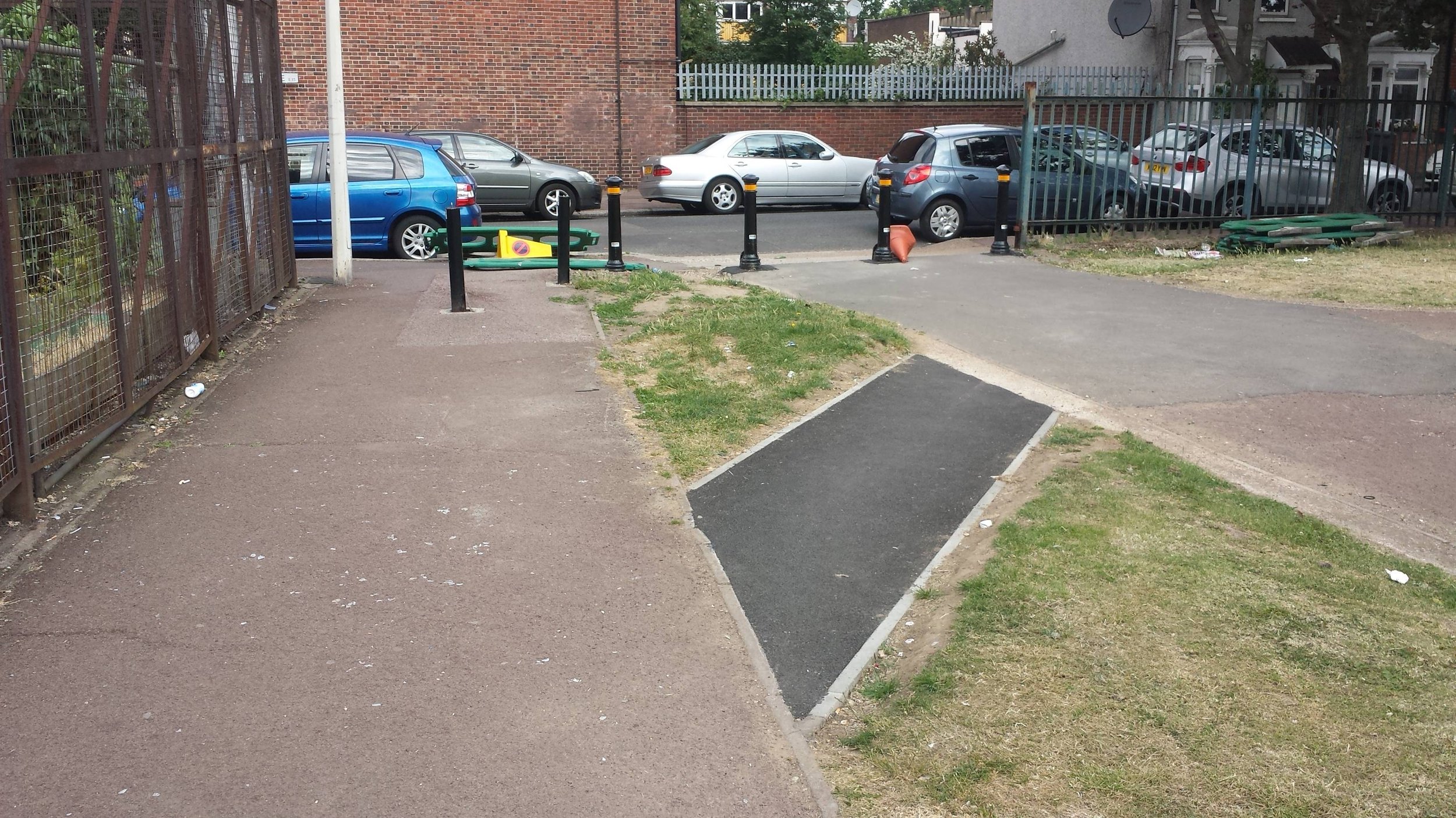
It is perhaps not surprising to say that I am constructivist at heart. As an educator, I try to hold space for the idea that most students are consistently attempting to make sense of the weird little educational worlds they find themselves in. These worlds tend to operate in very different ways to the other worlds the students occupy. Every time a student ‘tramples a flowerbed,’ or deviates from the path I have laid out for them, is important data for me. These desire lines communicate something about where the students are at, how they are negotiating and organising their experiences and what I might need to do to better support or accommodate that.
As it turns out, desire lines were the perfect visual metaphor for the way students engaged with my carefully designed learning experiences. Because, surprise, surprise, it turns out that graphic design education is full of unchallenged norms. Ways of doing that may well have outlived their usefulness.
Let's go back to that list
— workshops
— lectures
— discussions
— critiques
— tutorials
The first thing to note about the items on this list is that they're all pretty verbal. Apparently we Graphic Designers LOVE to talk. I had barely questioned this logic until I started to teach increasingly diverse cohorts, for whom verbal language can be a problematic way to meaning.
I don't wish to surrender myself to the deficit model of talking about students. It's a boring, convenient retreat for a lazy educator. However, it seems practical to note that bilingual students often have slower listening speeds than other students (De Vita 2000). As such, it can be a real struggle for a bilingual student to keep pace with a discussion. In this way, lectures, discussions, critiques and tutorials can be very excluding formats. They often provide very little space or time for students to process information, let alone formulate a response. I have noticed how these overly verbal formats can really prevent students from participating in their own learning. Anyone who has lived or learned in a second language will be familiar with this experience. It's familiar to me as somebody who has lived and studied abroad.
So often, the result is silence. Followed by confusion. Occasionally helped by asking another student who understood. But often not. Later at assessment, we see that an opportunity has been lost.
Still, we persist with the list
About three weeks into term, I realised that all my carefully planned talks, workshops and (very verbal) learning experiences were not working. As a Course Leader, mid-term, throwing out 'the list' was not an option. If the weakness of the list was that it relied on overly verbal formats, then what might their (more) visual versions be? It seemed useful to consider how Graphic Design might be useful to the challenges of teaching Graphic Design. Could I follow the desire lines towards some preferred interactions?
Now for the rocket science...
Drawing. I know.
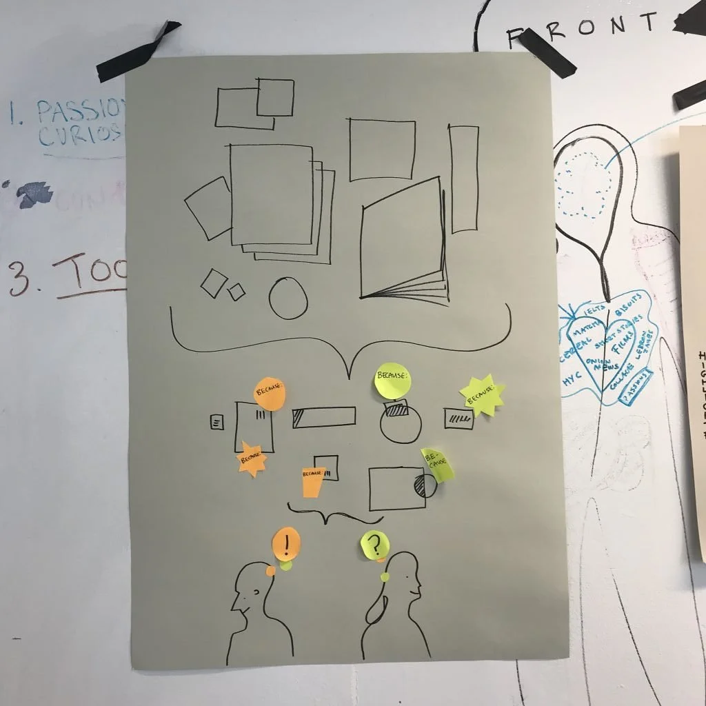
We followed one of our students down this particular desire line. For this student, verbal cues were not just problematic, they were often useless. He was not only working in a second language, he was deaf. Many conversations with this student happened with a pen and paper or a pile of PostIt notes. Following his lead, we co-designed ways to draw and write conversations. While we found that the pace of the discussion slowed considerably, this was actually a strength in a number of ways:
Drawing forces brevity and clarity. You have to think much harder about the question you are asking or the point you are making.
It's hard to be precious about these kinds of drawings. One person can draw something, another can edit it. Lines can be drawn, things can be circled, links can be made, quickly and iteratively. You can highlight the most useful points in the discussion. You can turn a series of drawings into a sequence or a diagram. Conversation becomes an interactive negotiation, a co-creation. These types of conversations are not limited to two people, they work in groups too.
Theres a visual record of the conversation. Students can take the drawings/notes away and reflect on them.
Klebesadel and Kornetsky (2009) argue that critique is 'a structured, student-focused learning activity' that serves with three key functions:
it’s an assessment and a generator of critical feedback
it clarifies the discipline’s objectives and values
it facilitates students’ understanding of how professionals achieve their goals
At no point do they say that these activities must be verbal.
After starting to use drawing more widely in critique, we noticed significant differences in the ways that students were interpreting their feedback. In unit assessments, there was much less confusion around terminology and much more focus on the actionable points of the feedback.
Scaling it up
Slow reading speeds were also a significant barrier in workshops where we tended to use a mix of verbal cues and slide presentations. Aside from the reading speed, there was also a sequencing issue. Once a presentation moves on, the instructions are gone. We were noticing a comprehension gap.
The desire line here was interesting. Students were following downloaded, pre-annotated workshop briefs rather than the presentation or the workshop itself. This prevented them from being fully present alongside peers in the workshop. Had we not provided the briefs in advance, they might have been lost completely.
So we started to use drawing in our workshops too. Instead of using the projector to explain the activities, we would draw them on the wall.
We used key words, building up the drawing with the new steps and slowly providing a ‘complete picture’ of the process. It's was rough and ready but it worked. It wasn't too much work for us as this is how we plan our workshops anyway...

To sum up…
Drawing.
On a graphic design course.
Not exactly a game changer I know.
Taking the lead from our students in developing these approaches, we have found that teaching and learning activities that sit somewhere in the middle of verbal and visual have the capacity to be more inclusive. It represented a new and more accessible way to generate different forms of instruction and critical feedback. (Klebesadel and Kornetsky, 2009)
It also clarified some of the discipline’s objectives and values. Brevity, clarity, sequence, relationality, co-creation and let’s face it… visualising stuff are just some of the ways that professionals achieve their goals. So this approach acts as a continuous type of practice for the challenges our students will face in their professional lives.
That we are doing this too, as tutors, flattens that hierarchy a bit. Meaning isn’t defined by the person with all the words. It’s negotiated. In that process, concepts can be named and words can be learned. Sometimes in both languages. It’s an exchange.
We’re still trampling through those flower beds.
But this time, we’re in it together.
And we’re trampling some of our own in the process.
References
Crose, B (2011). Internationalization of the Higher Education Classroom: Strategies to Facilitate Intercultural Learning and Academic Success. International Journal of Teaching and Learning in Higher Education, 23(3) 388-395
Devita, G. (2000). Inclusive approaches to effective communication and active participation in the multicultural classroom: An international business management context. Active Learning in Higher Education, 1(2), 168–180. https://doi.org/10.1177/1469787400001002006
Klebesadel H and Kornetsky L (2009) Critique as signature pedagogy in the arts. In: Gurung R, Chick N and Haynie A (eds) Exploring Signature Pedagogies:Approaches to Teaching Disciplinary Habits of Mind. Sterling, VA: Stylus, pp.99–120.
Logan C (2006) Circles of practice: Educational and professional graphic design. Journal of Workplace Learning 18(6): 331–343.
Shulman, L. S. (2005). Signature Pedagogies in the Professions. Daedalus, 134 (3), 52-59.